Law Fitness logo with stylized LF letters in a yellow square next to text 'LAW FITNESS' over a gym background with a trainer assisting a person on a leg press machine.

Brand Identity Design

LAW Fitness

Brand Strategy
Brand Identity
Logo Design
GRAPHIC DESIGN
Social Media Templates

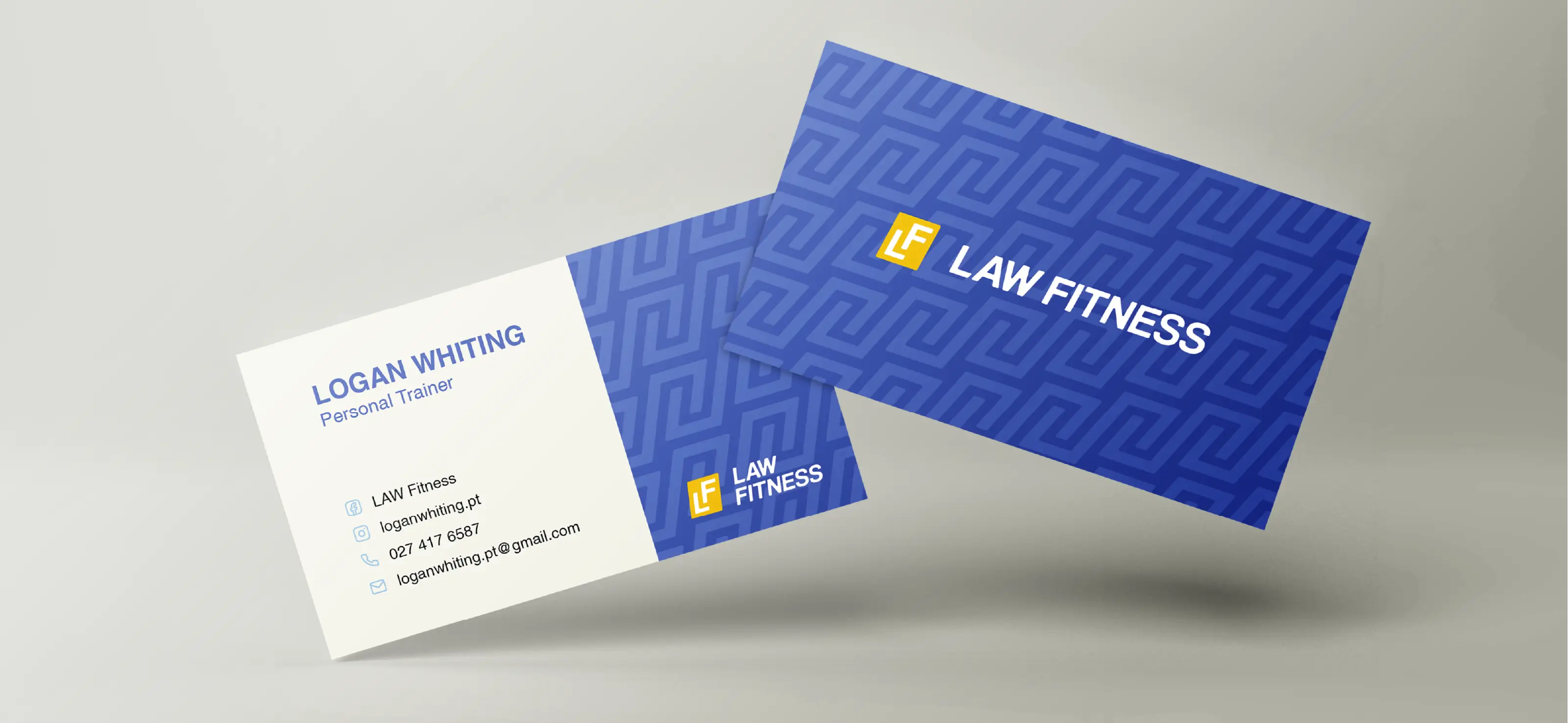
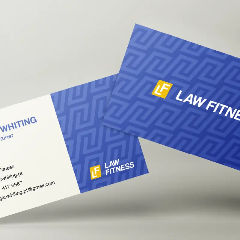
LAW Fitness is a personal trainer business needed a brand identity that genuinely spoke to Christchurch men aged 18 to 25. The fitness world is full of clichés, so we dug into the research and found a clear gap. The research showed young men wanted support that felt personal, genuine, and down-to-earth.

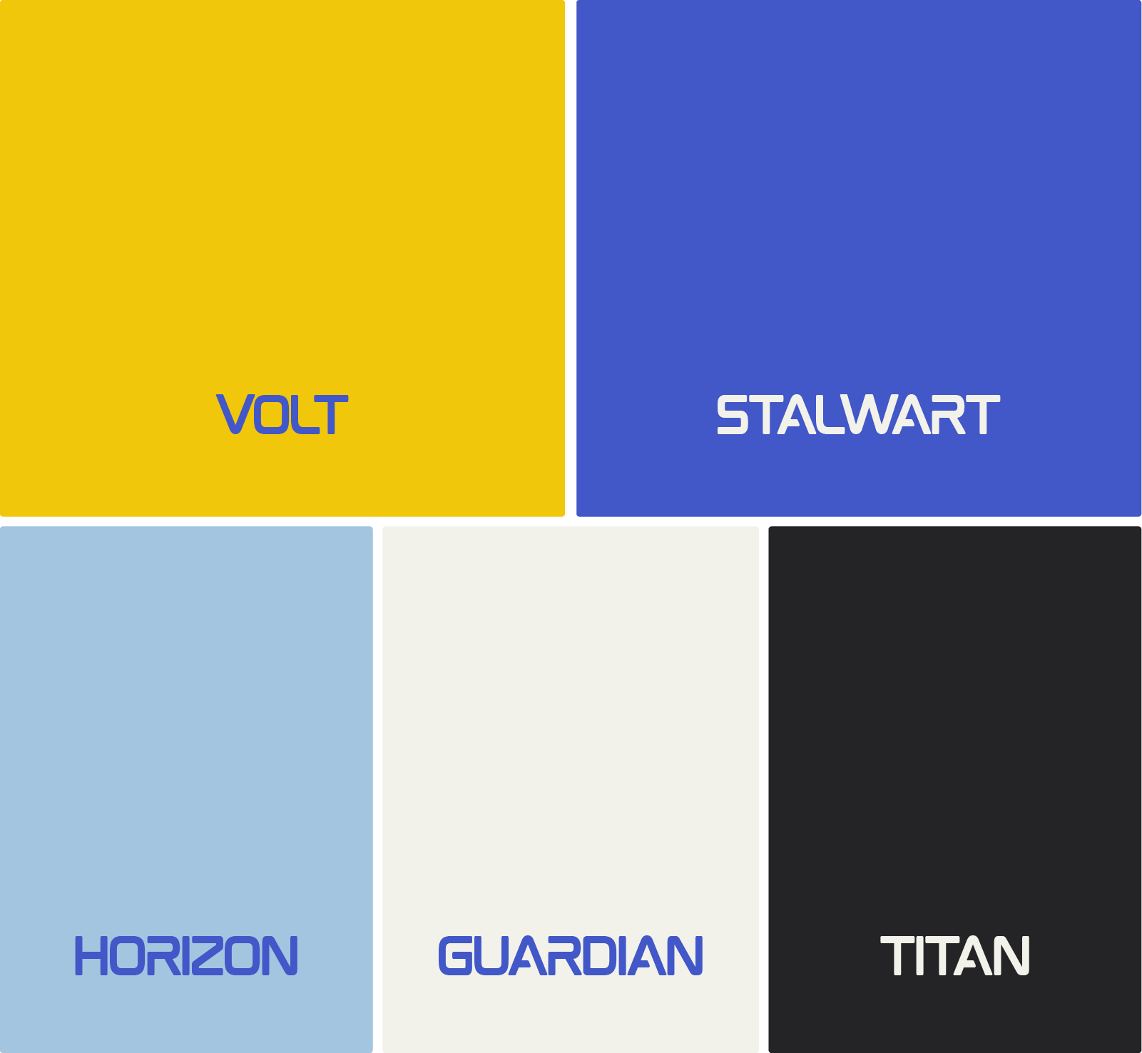
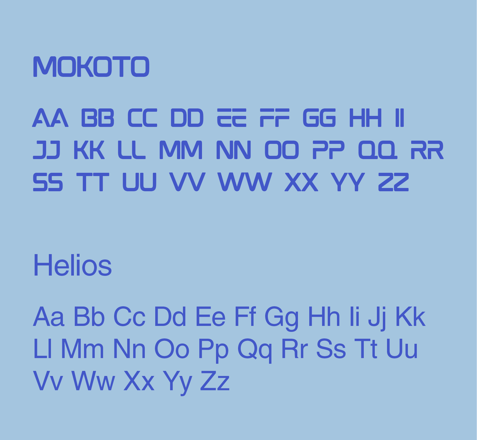
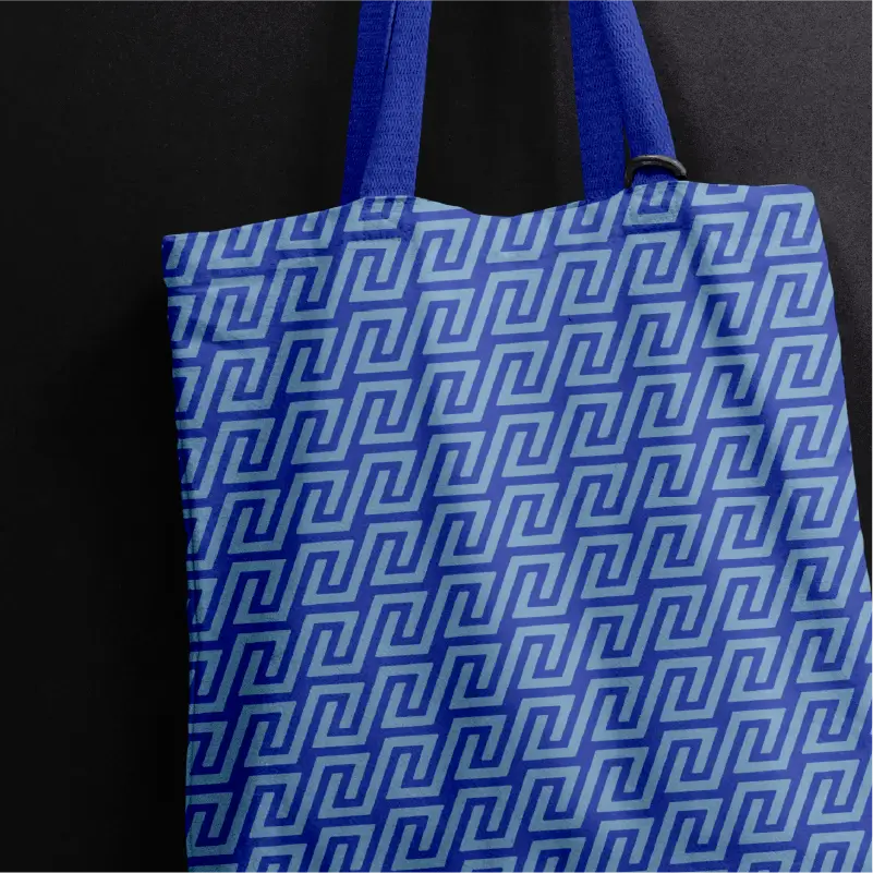
That insight became the Single Organising Idea of Brotherly Guidance. No pressure. No ego. Just real fitness for real guys. From there, we created a bold but friendly visual identity using strong type, energetic colour that they were drawn to, a brand pattern inspired by the 'dap', and honest imagery that matched the way the audience sees themselves.

The result is a clear, modern brand identity that cuts through the noise and positions LAW Fitness as the place where real guys find real support.

Blue water bottle with a black lid featuring a yellow and white LAW FITNESS logo.
Law Fitness blue handwritten signature as a brand asset, overlaying an image of Logan Whiting, LAW Fitness' founder and personal trainer.
Blue tote bag with a darker blue geometric maze brand pattern and matching blue handles against a dark background.
Personal trainer business cards with a subtle blue brand geometric pattern, LAW Fitness logo and the personal trainer's details.

Client Thoughts

"Working with Goulden Design was such an easy process. I got answers to questions I didn't even know to ask, and the final result looks fantastic! Thanks for helping bring LAW Fitness to life."

Personal Trainer business LAW Fitness primary logo of white L and F in an angled rectangle with the words LAW FITNESS beside it stacked.

Driven by the idea of Brotherly Guidance, this identity turns emotional insight into a personal trainer brand young men can trust. In a space crowded with high-pressure, ego-heavy trainers, LAW Fitness offers a calmer, more relatable path for beginners finding their footing.

Logo design of white letters LF inside a yellow square next to the words LAW FITNESS in white on a blue background.LAW FITNESS secondary logo design with stylized blue square containing white L and F letters next to bold black text.Logo Mark Design for Personal Trainer Business: Stylized white letters L and F intertwined inside a tilted white rectangle on a yellow background.
Logo for Law Fitness annotated, featuring tightly fitted letters 'L' and 'F' in a rounded-corner square symbolizing trainer-client bond, and slanted bold text 'LAW FITNESS' indicating movement in a fitness journey.
Law Fitness personal trainer brand identity colours of yellow, electric blue, pale blue, cool toned white and cool toned dark charcoal Typography sample of Law fitness brand fonts, Mokoto for headings and Helios for body text.
Seamless brand pattern of light blue angular spirals forming a geometric maze-like design on a pale background. The shape forms two hands clasping in a greeting.
Fitness flyer titled New Year, New Fitness Journey with images and text about muscle building, weight loss, boxing/kickboxing, nutritional guidance, and LAW Fitness Council approved locations.Blue water bottle with black lid featuring a yellow and white 'LAW FITNESS' logo.
Blue business card for LAW Fitness with yellow logo design, displaying personal trainer Logan Whiting's contact details.

Ready For Your Brand To Stand Out?

No fluff, no confusion. Just results.

Let's Talk Brand Design